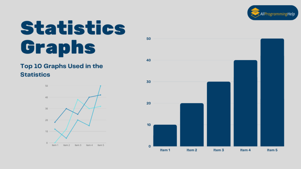
In statistics and mathematics, we can use graphs to represent a large amount of data. These graphs support representing every term of data easily. We can use statistics graphs in the study of statistics and mathematics. So you must know all the graphs used in the statistics.
Graphical information helps us to represent and understand data very well. There are several types of graphs. Each has advantages and disadvantages. Statistics graphs are very important to understanding complex data. Without the study of graphs of statistics, we can’t represent the data in graphical form.
In this blog, you will get to know all the basic details of statistics graphs, and we assure you the knowledge you get from here will definitely help you. Read this article with full concentration and focus till the end. In this article, we will explain all the types of graphs mostly used in statistics.
What is Statistics?
Statistics is the branch of mathematics that deals with the study of data and collects, interprets, and organizes the collected data. We can organize the collected data in graphical form and make it easy to understand. We can use statistics in so many fields. We must use statistics graphs in every field of statistics. So it would be best if you learned about statistics and the types of graphs used in statistics.
Types of Statistics Graphs
There are several types of statistical graphs that we are going to discuss in this article. You should study this article carefully to understand the statistical graphs. So let’s begin our discussion on graphs of statistics.
Bar Graphs
The bar graph is the pictorial representation of data in both horizontal and vertical bars. The length of the bars is proportional to the measurement of the data. With the help of bar graphs, we can compare things between the different groups or track changes over time.
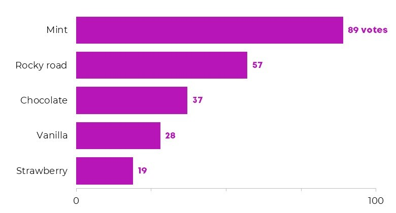
This is the horizontal bar graph. In the above image, you can see that all bars are displayed in horizontal lines. By using this image, you can analyze what thing is mostly liked by the customers and what thing is disliked by the customers very easily. It could take some time to understand if this information is presented in collected form in a dairy or excel file.
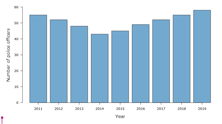
This graphic demonstrates that all bars are plotted vertically. Additionally, you can see that statistics from various years are contrasted with data from other years. You can determine whether there are more or fewer police officers in a given year.
Grouped Bar Graphs
Grouped bar graphs are those in which a group of bars appears for each value of the function. In this type of bar graph, bars are organized into groupings that are known as grouped bar graphs.
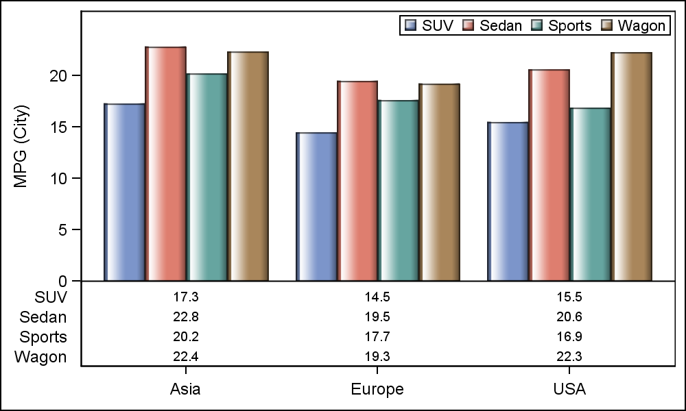
In this graph, you can see that bars are present in the groups. There are three countries’ data presented on types of four-wheelers: Asia, Europe, and the USA. Four types of vehicles in that country were compared SUV, Sedan, Sports, Wagon, etc.
Line graphs
Line graphs are graphs in which lines are drawn on the graph in straight lines or curve lines. That can be horizontal lines or vertical lines. That graph is plotted after solving the equations. That equation can be linear, parabolic, hyperbolic, etc. Line graphs are also present in so many terms.
a.) Line graph for linear equation.

This is the line graph of a linear equation, in which you can see straight lines.
b.) Line graph for a parabolic equation
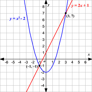
This is the line graph of a parabolic equation, in which you can see a line in the curve form. This is plotted after solving the parabolic equation.
c.) Line graph for a hyperbolic equation

This is the line graph of a hyperbolic equation, in which you can see a line in the curve form. This is plotted after solving the hyperbolic equation. You can observe that it is in horizontal and vertical forms.
Histograms
A histogram is a graphical tool for statistics that is very popular and it is used to summarize data and whether data is discrete or continuous. It is measured on the interval scale. It is a very important statistics graph on which we represent the data very easily. It is a very important graph from the statistics graphs.
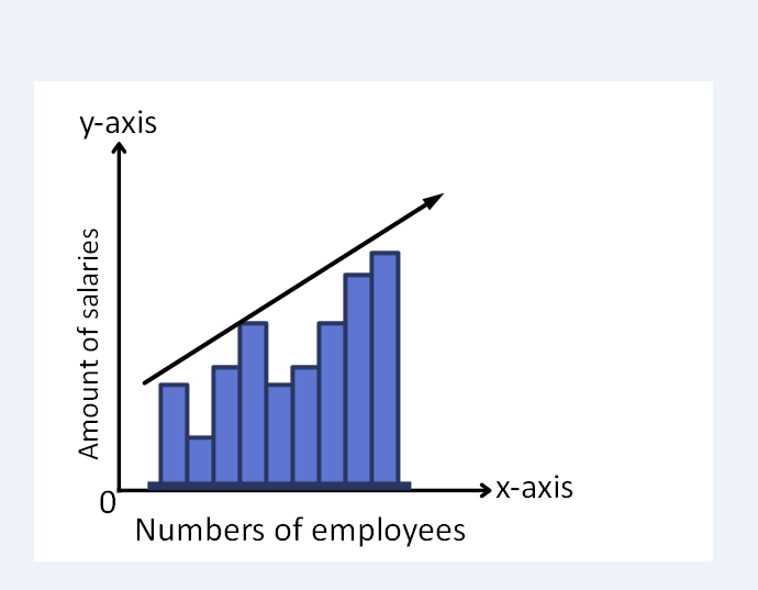
This is the histogram in which you can see that data of numbers of employees and their salaries are represented very well.
Pie charts
A pie chart is a graph that is in circular form like a circular pie. Did you know that the angle of the circle is 360 degrees? It is made to represent the qualitative data not the quantitative data in numerical form. You can see the different slices in the pie chart which represent the different data in the pie chart.

In this pie chart, you can see the different parts for different things which show the data in the percentage form (%).
Exponential Graphs
Exponential graphs is that graph, in which all study of exponential functions uses all tables of values and all points are drawn on the graph is known as exponential graphs. It is the inverse of the logarithmic graphs. In this graph, all curves can be in the increasing form and decreasing form.
The exponential function is y = b x.
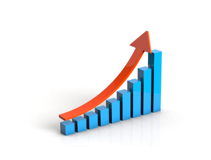
This is the increasing exponential graph in which it rises upwards.
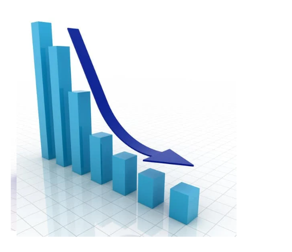
This is the decreasing exponential graph in which it decayed downwards.
Logarithmic graphs
The logarithmic graph is the graph in which we plot the graph accordingly to the values of the table. It is the opposite of the exponential graphs. If you want to plot the logarithmic graph first of all you should make the table of data. Then you can plot those values on the graph.
The logarithmic function is y = log b x.

Trigonometric Graphs
Trigonometric graphs are used to plot trigonometric functions like sine, cosine, tangent, cosecant, secant, cotangent, etc. These are the 6 trigonometric functions for which we can plot the graphs.

This is the graph of the sine function of trigonometry.
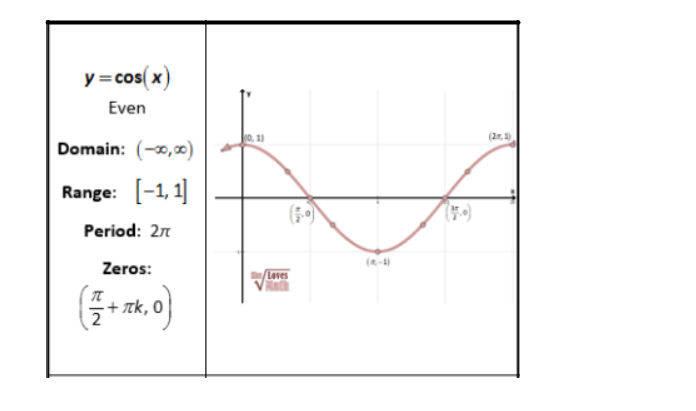
This is the graph of the cosine function of trigonometry.
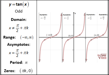
This is the graph of the tangent function of trigonometry.

This is the graph of the cotangent function of trigonometry.
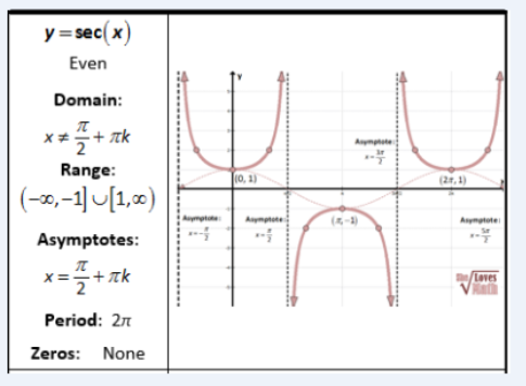
This is the graph of the secant function of trigonometry.
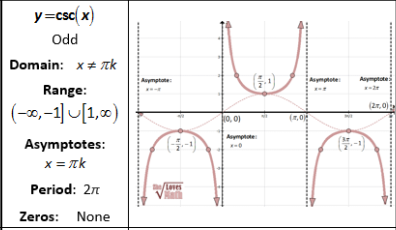
This is the graph of the cosecant function of trigonometry.
Scatter Plot
A Scatter plot is one of the important types of statistics graph. It is plotted according to the horizontal line (x-axis) and vertical line (y-axis). In this, correlation and regression is a very important statistical tool to make the scatter plot. It is very important for every statistics learner or student.
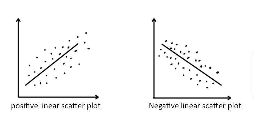
This is the scatter plot for correlation or regression in which you can see that it is in two ways positive or negative.
Box Plots
A box plot is a type of graph in which we draw this graph for five variables. In this outer bound of the box, the plot shows the first and third quartiles. The line that is between the graph is known as the median. That mark that lies outside the graph refers to the outliers and represents data points. Which are outside of the 25th and 75th percentiles.

Conclusion
In this article, we discussed statistics graphs. It is very important that you must learn about the graphs of statistics. Because it is the base of statistics and mathematics. Without having the knowledge of statistical graphs you can’t study statistics. We have discussed all types of statistics graphs. I hope that the article will be helpful for you.
If you are facing any issues with statistics assignments, you can contact us for the best statistics assignment help services.
FAQ (Frequently Asked Questions)
Why are graphs used in statistics?
Graphs are used in statistics to depict the relationship between variables or the range of values for a particular variable or occurrence. The graphs that are used to visualize data the most frequently are described in this section.
Which graph types are used in statistical analysis?
Bar Charts
Box Plots
Histogram
Pie Charts
Scatter Plots